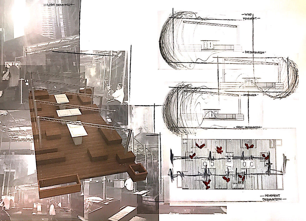
Week 2
- gabriellakaren3
- Mar 17, 2019
- 1 min read
Updated: Apr 10, 2019
Homework

The refined image of the interior drawing from the Building 10 of RMIT (A3 size). I used color shading to show depth on the image and accentuate the lighting and shadow as well as the texture and materiality within the space. #onepointperspective#corridor


Comments